COLOR BALANCE TOOL
HUE AND SATURATION TOOL
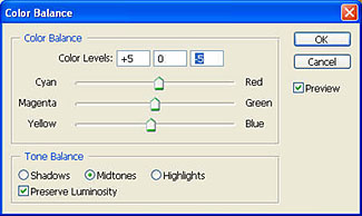
| Color Balance | |
| Color
balance is also somewhat self explanatory. In most graphics programs you
can click and drag 'sliders' to adjust the color balance of your digital
photograph. In the "Color Balance" tool example below on the left we have added some red and yellow to warm
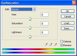
up the photo a little. Some imaging programs also
have a "Hue and Saturation"
adjustment. Hue and Saturation allows you to control the color tint (HUE)
and
the intensity of color (SATURATION) and the darkness or lightness. You can
do this on the MASTER channel which includes adjusting RED GREEN and BLUE
simultaneously or you can
do these adjustments on each color channel separately. Many imaging programs
also include a tool called "Variations". This approach puts up a bunch of
thumbnail images of your original in a 'color circle' type of arrangement.
You can see how your image would look with 'more red' or 'more green' or
'lighter or darker'. If you see a 'Variation' that you like, just select it
and the tool sets your original image to the new color balance. See an example of
Photoshop Elements 2 "Variations" tool at the bottom of this page. Notice
that both the "Color Balance" and the "Variations" tool allow you control
which tonal range areas of the image your color adjustment primarily effects
(Shadows, Highlights or Midtones) |
|
|
COLOR BALANCE TOOL |
HUE AND SATURATION TOOL |
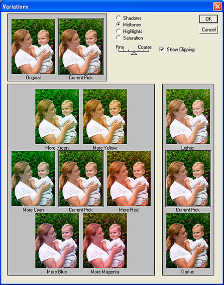
PHOTOSHOP ELEMENTS 2 'VARIATIONS TOOL'