A PRACTICAL GUIDE TO INTERPRETING RGB
HISTOGRAMS
Learn how to interpret your digital camera's thumbnail image histogram to
help determine proper in camera exposure
Learn how to adjust tonal range in your scans or existing digital images
using the levels-histogram tool
PAGE 2
|
HISTOGRAM AND RGB COLOR AND TONAL RANGE EXPLANATION - Part 2 |
|||||
| There are three different kinds of histograms. The
most commonly used is the RGB histogram. The RGB histogram is a
composite graph of the tonal values for each color channel RED, GREEN
and BLUE. Another type of histogram is a Luminance histogram. The luminance
histogram is basically an RGB composite histogram that takes into consideration the human
eye's greater sensitivity to green, then red and lastly blue. This
type of histogram is also sometimes called a 'brightness' histogram
because it displays a 'compensated brightness' range. The luminance
histogram gives you the best graphical representation of the visual brightness
and contrast of your image. You
can also view each individual color channel's tonality by viewing
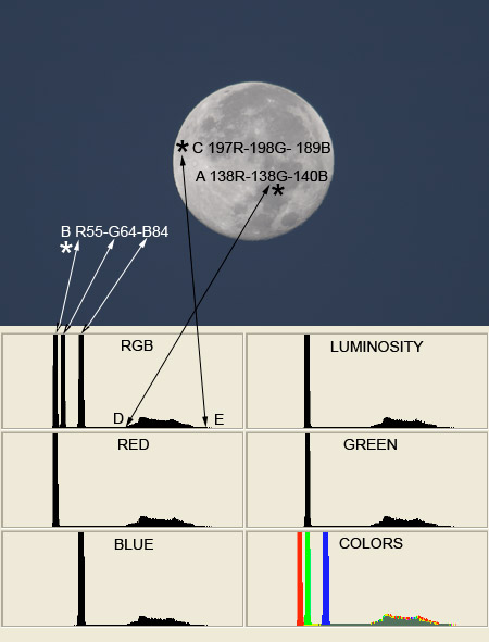
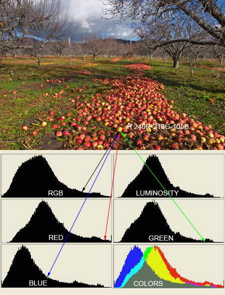
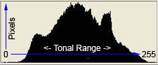
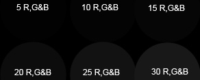
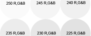
an individual channel histogram for each color RED, GREEN and BLUE. Some imaging programs allow you to see only the RGB or only the luminance histogram. Photoshop's Levels tool will allow you to view and adjust a master RGB histogram or adjust each color channel individually while viewing the histogram for the selected color channel. Photoshop 7's 'image / histogram' shows a histogram palette with choices to view RGB, R, G, or B and luminance histograms for the open image. Photoshop CS has a floating histogram palette that lets you select to view each type of histogram and an option to view the histogram for each color channel and a luminance or RGB histogram all on the same palette simultaneously. Photoshop CS also has an overlay histogram of the separate color channels that Adobe calls the 'colors' histogram. The Photoshop CS histogram palette also shows the effects of your image adjustments with changes to the histogram graph in 'real time'. Your digital camera may show either a luminance or an RGB histogram if it has a histogram view option available during image review. Either type of histogram will work to help you determine proper 'in camera' exposure. However, it would be beneficial to know which type of histogram your camera is using. Sometimes your camera's documentation will tell you which type of histogram is used in the image playback/review. If your camera's documentation doesn't tell you which type of histogram it uses, it is fairly easy to determine which type of histogram your camera is displaying. Take a picture with your camera. Download the image to your computer and open it in your image editing program. Compare the RGB and luminance histogram of that photo in your imaging program to the same photo's 'in camera' histogram. Since a luminance histogram has had some perceptual compensation (unbalanced averaging) applied, it may not always show you if you have pixels in the 0 or 255 tonal area. Not having the full 3 channel RGB histogram can make interpreting 'in camera' histograms a bit harder. We will discuss methods for interpreting digital camera thumbnail image histograms a bit later. An RGB histogram is probably the best histogram to use for adjusting scans or existing digital images because it lets you know how many, if any, pixels are in the 0 and 255 range. The "bookends" (0 and 255) of the histogram are very important. Even with high key and low key images you usually don't want to see a lot of pixels climbing up either the left or right margin of the graph. There really isn't very much noticeable texture (color) in an image when all three color numbers are above 250. On the other end of the graph there really isn't much detail or texture in the shadow areas when all the color numbers are under 20. See the examples below. |
|||||
 |
 |
||||
|
|
|||||
|
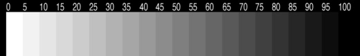
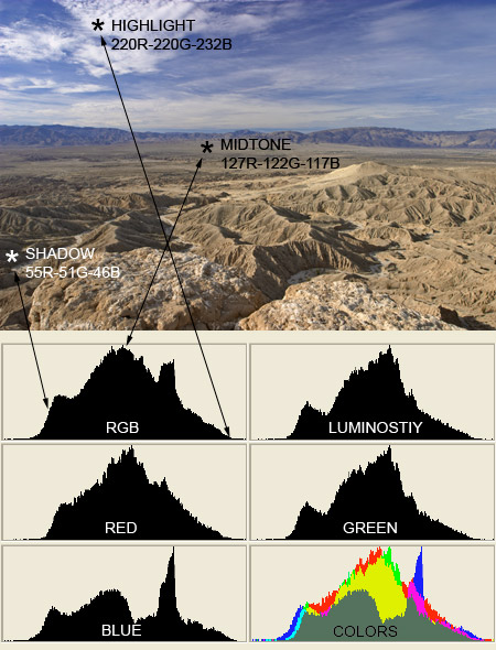
If your monitor is adjusted correctly, you should see a slight difference between 95 and 100 and 0 and 5 in the grayscale pattern below my color number samples. If this is not the case, click here to go to a very simple monitor calibration adjustment routine. Your monitor must be running true color at either 24 or 32 bit depth to view photographs properly. On my monitor I can see a very slight difference between 20R,G&B and the pure black background on my 'black' color number example image. My Epson 2200 printer will also resolve this difference to a barely noticeable degree too. The high key color number samples are more discernable with a good differentiation between the sample disks and the pure white background all the way up to 250R,G&B. I see the same results on prints from my Epson 2200 for the high key samples. There may be instances where your darkest shadows have to go pure black to maintain proper exposure in the rest of your image. In cases like this it would be acceptable to have the pixels representing the darkest shadows climbing up the 'black' or left side of the graph. It would be a very rare photographic situation where the image content would justify a lot of pixels climbing up the 'white' or right side of the graph. Studio lighting where you have strong background lights to 'washout' your white background would be one example. We will proceed by having a look at some example images and their corresponding histograms. In the first example below we have a photo of Font's Point in Anza Borrego Desert State Park. We also have included the different histograms for this image along with the extra 'colors' histogram that Photoshop CS makes available. The colors histogram is an exact overlay of the three separate color channels and shows a colored graphical distribution of all of the colors RGB and the CMYK colors where the tonal range for the RGB colors overlap. |
|||||
|
|||||
|
|||||
|
|||||
|
This photograph was shot late in the day on 4X5 Velvia, thus the warm
colors. You can see a verification of this by looking at the blue
histogram. The blue histogram is quite to the left of center, which
confirms our visual of the dominance of warm tones in this image. In the next section we will have a look at the 'levels' tool in Photoshop. The levels tool is a very good tool for adjusting tonality in digital images. This tool is available in almost every image editing program. |
|||||
LINKS:
|
|||||
|
|||||